Igloofest
Humanithon 2025
October 17-19th, 2025
Mobile App Concept
Overview
Humanithon:
a 3-day hackathon for UX designers and researchers to work their creative muscles
Team Roles:
Dahlia: UX research, UI design, and presentation
Jonathan: UX research, wireframes, and presentation
Sameya: UI design
Prompt:
“Create an original, branded mobile app concept for Igloofest that captures the festival’s identity while improving how users explore, plan, and attend the event.”
Day 1
Research & Findings
What is Igloofest?
With no prior knowledge of Igloofest, our primary task was to get familiar with it. We discovered that Igloofest is the “world’s coldest music festival," held annually in the dead of Canadian winter. It’s icy and energetic, with electronic music, neon lights, and a wacky snowsuit contest. It spans three to four weekends in three locations.
Who’s it for?
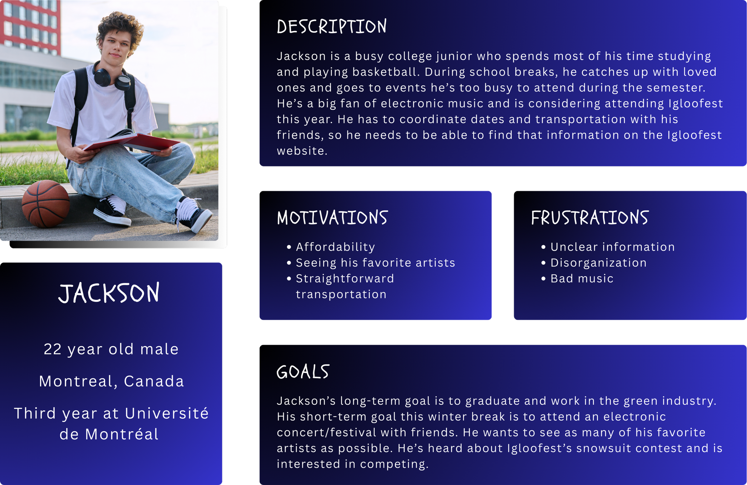
Due to time constraints, we knew user testing and surveys would not be possible. To understand Igloofest’s audience, we had to rely on secondary research from Igloofest’s website, their social media, and third-party websites. I analyzed competitors and conducted secondary user research to understand their target audiences and create a persona to help guide design decisions. Meanwhile, Jonathan did a thorough UX audit of their website to identify strengths and weaknesses.
What’s not working?
For our UX audit, we spread out all pages of the website and commented where things were and weren’t working.
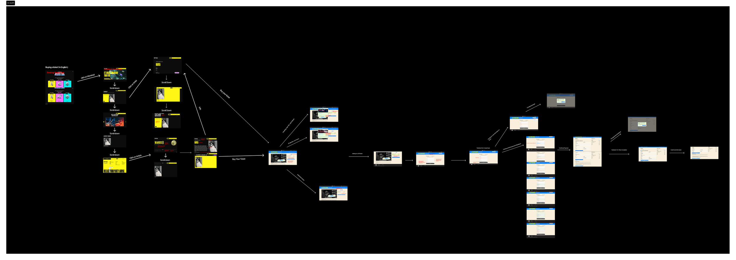
Pain Points Based on UX Audit
Inconsistency
Language is not consistent throughout the site. After users choose English, some information is still in French.
In Montreal, users can only buy tickets for individual artists, but in other locations, they can only buy passes for the entire event.
Lack of Clarity
The Montreal, Gatineau, and Quebec locations each have their own sub-sites, but it is unclear what the difference is between each of them.
The home page doesn’t contain the necessary basic information about the festival.
It is difficult to find out which artists are performing and where.
Day 2
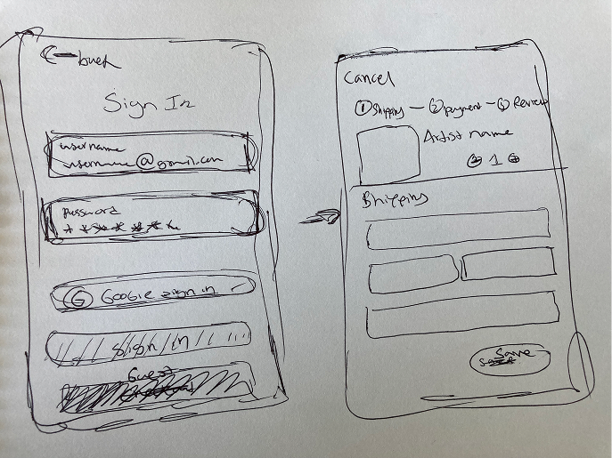
User Flows & Wireframes
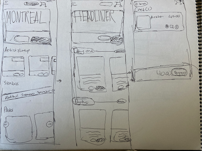
Wireframes
New user flow beginning from clicking on the home page and ending at payment (letters correspond to labels in Figma)

Solutions
Who, What, When, Where: make basic information readily available on the home page
Simplify user flow: instead of making users bounce from page to page, make it easy for them to find what they’re looking for and checkout
Consistency: make chosen language consistent throughout the site
Day 3
Prototypes & Presentation
Scope Creep and Prioritization
At this point in the design process, we were tempted to go above and beyond. We wanted to make the app as comprehensive as possible, but with only two days to make at least 5 screens, we knew we were limited in what we could do. Basic information (the 4 Ws), the lineup/schedule, and ticketing/checkout were nonnegotiable, as they are the primary reasons people will use our Igloofest app. For this iteration, we decided to exclude transportation options, non-performance events taking place within Igloofest, and food vendors.
Design Kit
While Jonathan and I researched Igloofest and its audience, Sameya created a new design kit. Our theme reflects the feel of Igloofest’s electric and icy winter nights. When you’re in the crowd, dancing to your favorite song, strobe lights turn you blue, purple and pink. The sky above you is black in contrast to the white snow beneath your feet. The logo looks like ice cracking below bright, bouncing sound bars.


Mockups
-
![]()
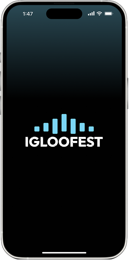
Splash
-
![sign in screen asking for email and password or option to use google or facebook logins]()
Sign In
We wanted to give users an efficient login process they have control over, so we gave them the options to create an Igloofest login, use their Google or Facebook accounts, or continue as guests.
-
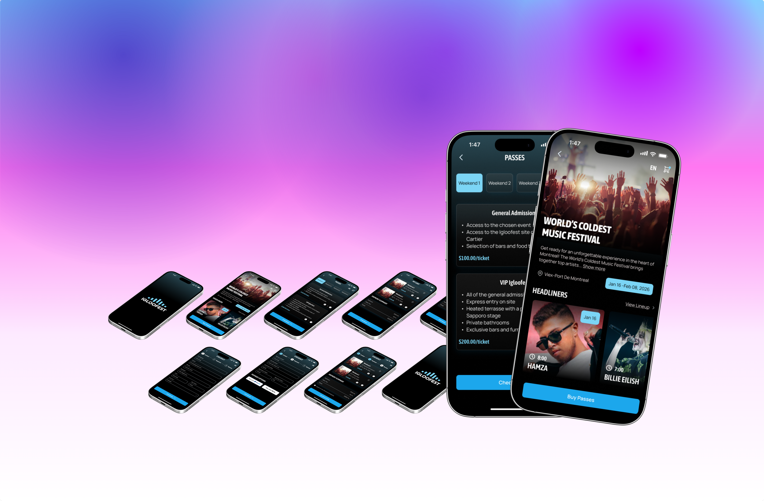
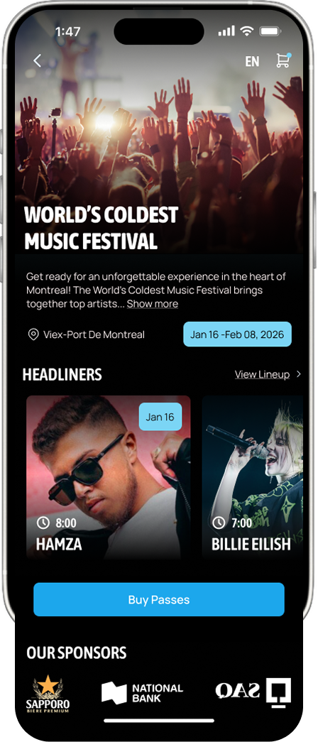
![igloofest home page with description of event, headliners, and button to buy passes]()
Home Page
All relevant information about the Montreal event is present, including dates, location, and a brief description of the event. The main headliners are showcased upfront with a button nearby to view the full lineup. Users immediately have the option to buy passes.
-
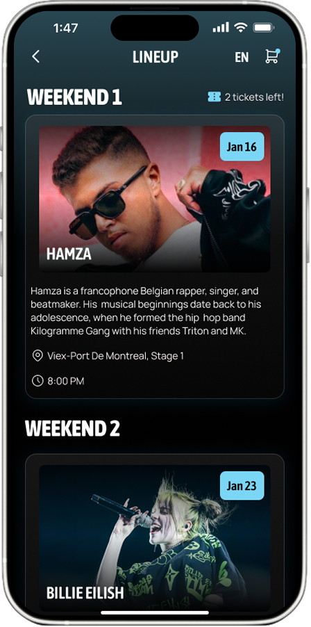
![lineup page showing main headliners for different weekends]()
Lineup
Here, users can view headliners. Due to time constraints, we did not create the page for the full schedule. When the number of tickets available gets low, people can see how many are left. To address the issue of inconsistency with ticketing, we decided to set a flat rate for different weekends (as is standard based on industry research) as opposed to having people pay for individual artists.
-
![Igloofest passes with general admissions and VIP options]()
Passes
Users can see what each ticket includes and add passes to their cart.
-
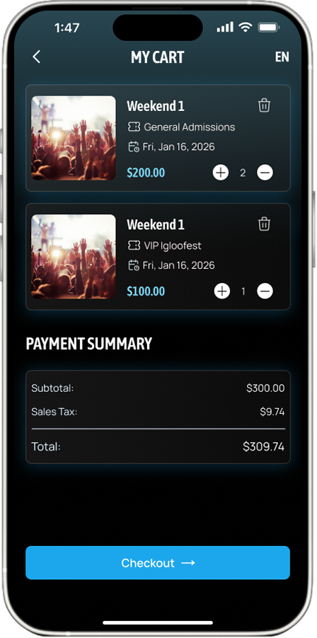
![cart page with two weekend 1 tickets in the cart and the payment summary with a checkout button below]()
Cart
Before purchasing passes, users get a final opportunity to preview their order and add or subtract tickets if they choose to.
-
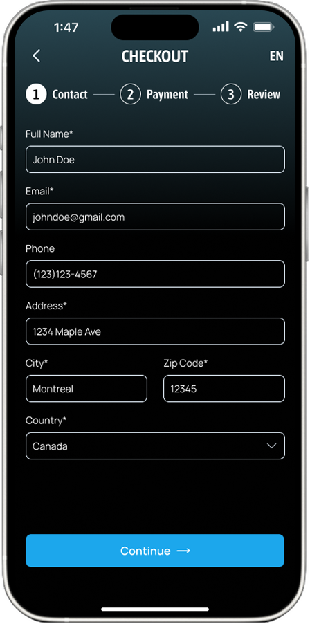
![checkout page asking for full name, email, phone number, and address]()
Checkout
We added breadcrumb navigation at the top of the checkout page so users have a sense of where they are in the purchasing process.
-
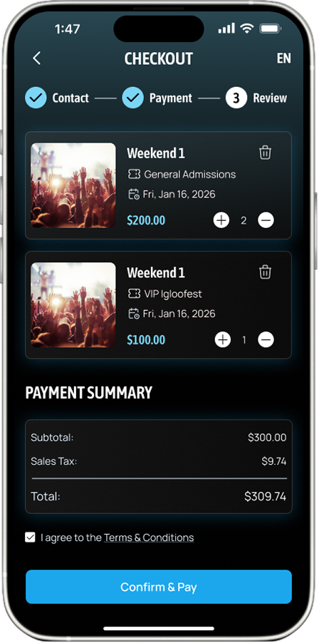
![confirm and pay page where users complete their transaction]()
Confirm & Pay
Users pay and have their tickets emailed to them.


Results
Within the two-and-a-half days my team worked on the Igloofest app, we prioritized accessibility, information, and aesthetics, resulting in a user-friendly and exciting app. The design kit adheres to WCAG 2.2 guidelines, and the broad details of the event are readily available, providing a seamless flow from learning about the event to purchasing tickets.
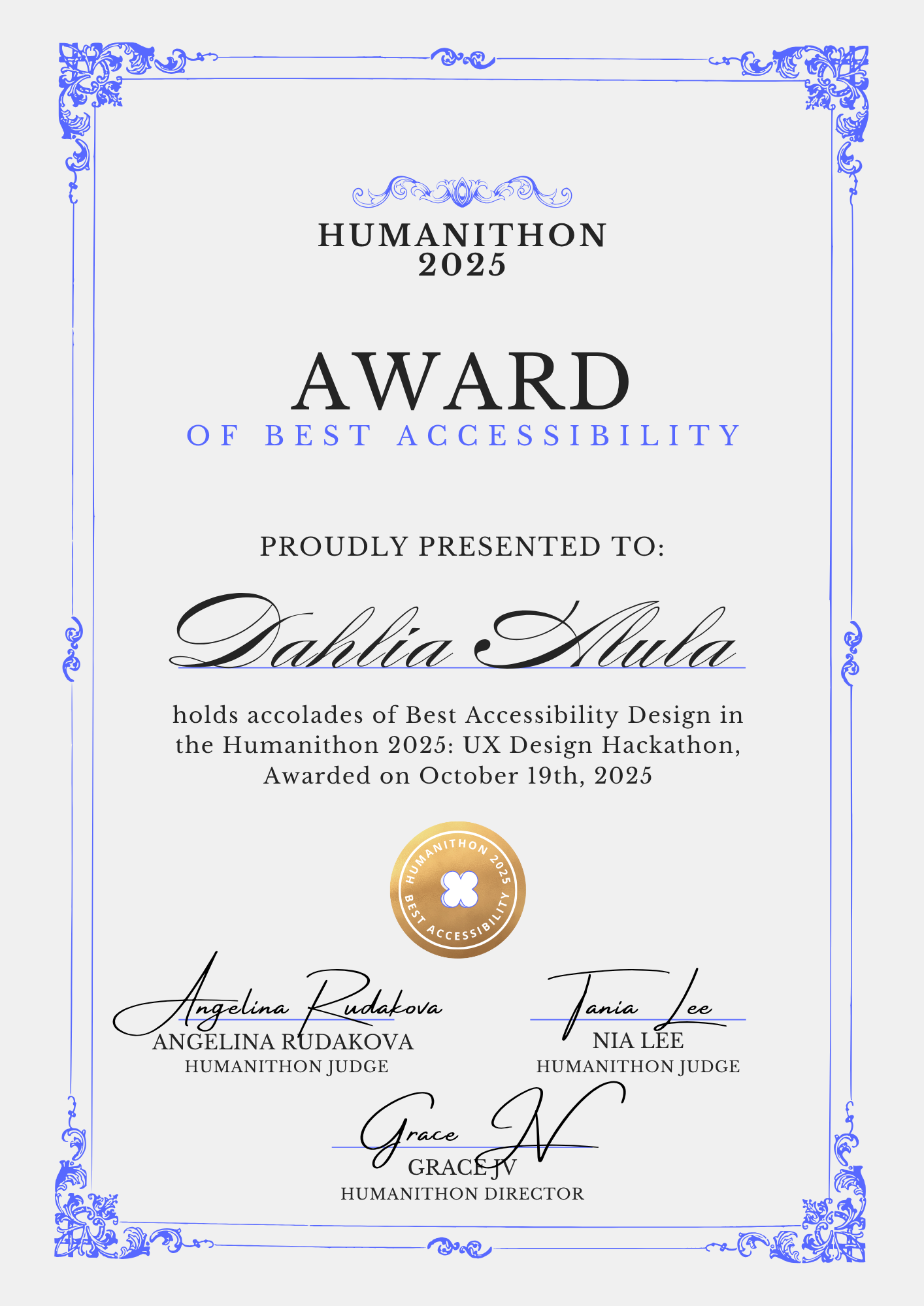
Best Accessibility Award
After presenting our project at the closing ceremony, we were given feedback and honored with the Best Accessibilty Design Award. Our team was proud that our efforts were recognized, and we knew there was more work to do.
Next Steps
Usability Testing: Time didn’t allow for testing during the hackathon, so I plan to administer observation tests and surveys and conduct interviews to make adjustments to the app where necessary.
Expansion: I want to add pages that give information about food vendors, happenings at different locations, transportation, and the festival’s history. Based on testing, I will decide the new information hierarchy.