LibraryThing Redesign
Bringing 3.1 Million Readers into 2025
October 2024 - December 2024
Background
Founded in 2005 by Tim Spaulding, a man who just needed a digital platform to catalog his books, LibraryThing has grown beyond his wildest imagination. By accident, it has become home to over three million readers worldwide, providing a space for people to discuss, recommend, and review books.
My Role
As the sole UX researcher and designer, I created and administered surveys, sketched wireframes, and created new, speculative visual designs for the site.
Problem
With the rise of “BookTok,” a corner of TikTok where book lovers gather to gush over their new favorite character or psychoanalyze the villain in their latest novel, people are telling the world that they still read. Possibly more than that, they want community with others like themselves. Readers need a platform to connect with each other and find new books, but many websites that cater to this audience are outdated and limiting in what they offer.
User Survey
I began with a survey to identify user goals and the obstacles that get in the way of reaching them.
All survey questions not shown
Findings
Respondents were frequent LibraryThing users all above the age of 34 and most 55+.
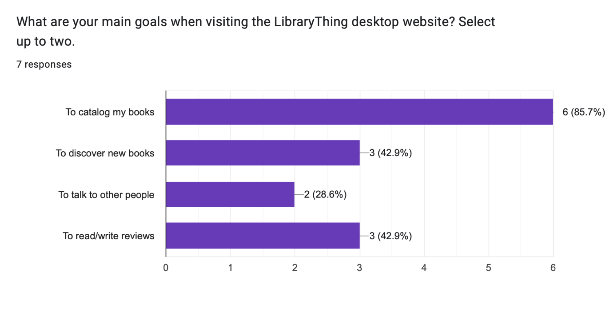
Users’ primary goal is to catalog their books. They also want to discover new books and read/write reviews.
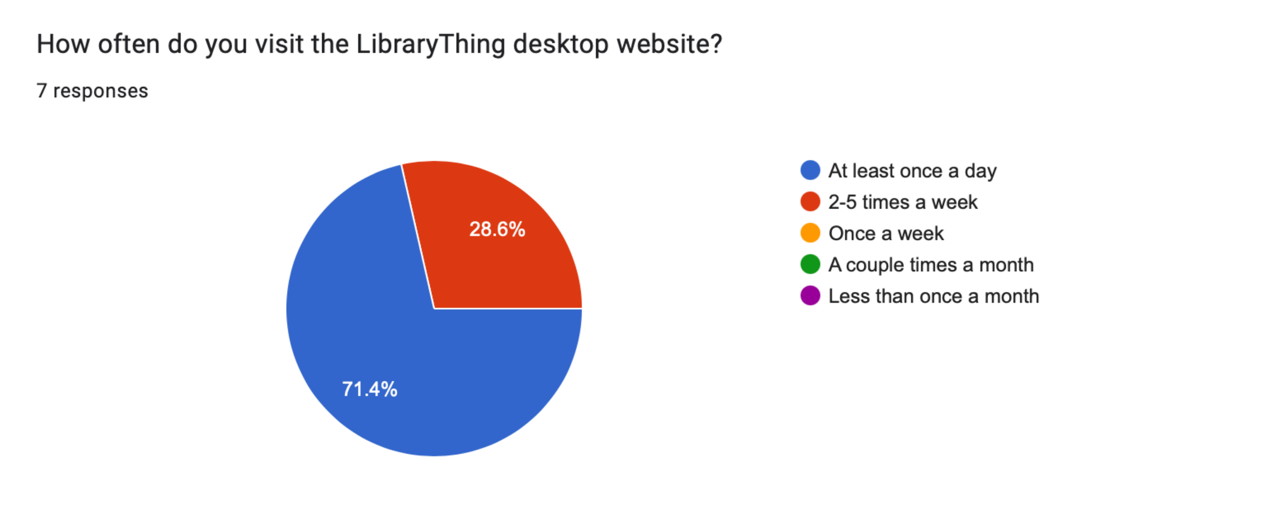
On a scale of 1-5, 71.4% of users rated their satisfaction with the current layout/navigation of the desktop site a 4.
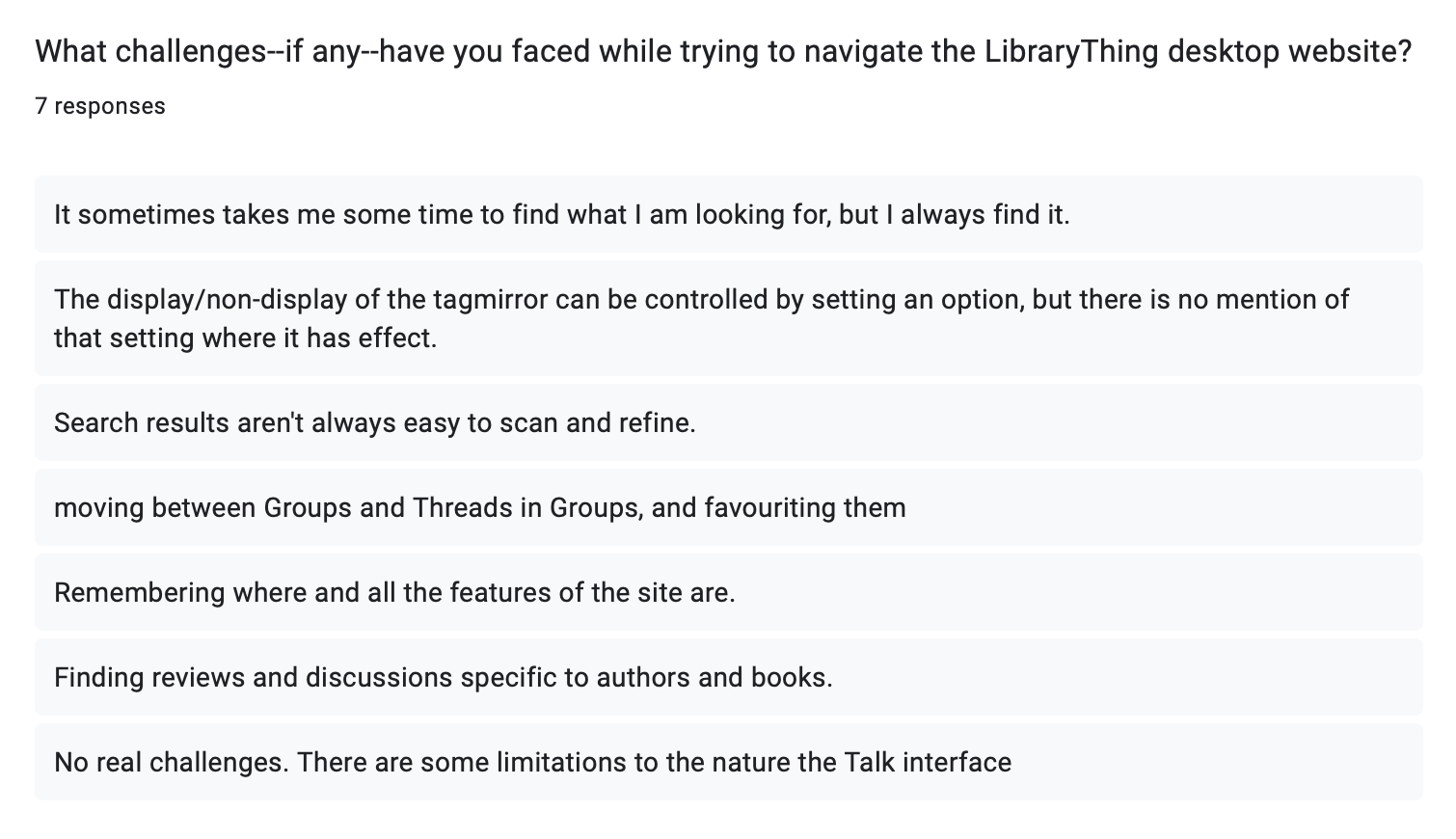
Their main challenges include poor navigation and unclear organization.
“It’s a really busy site (visually).”
“It sometimes takes me some time to find what I am looking for…”
“I’d like to be able to access some stuff a bit easier.”
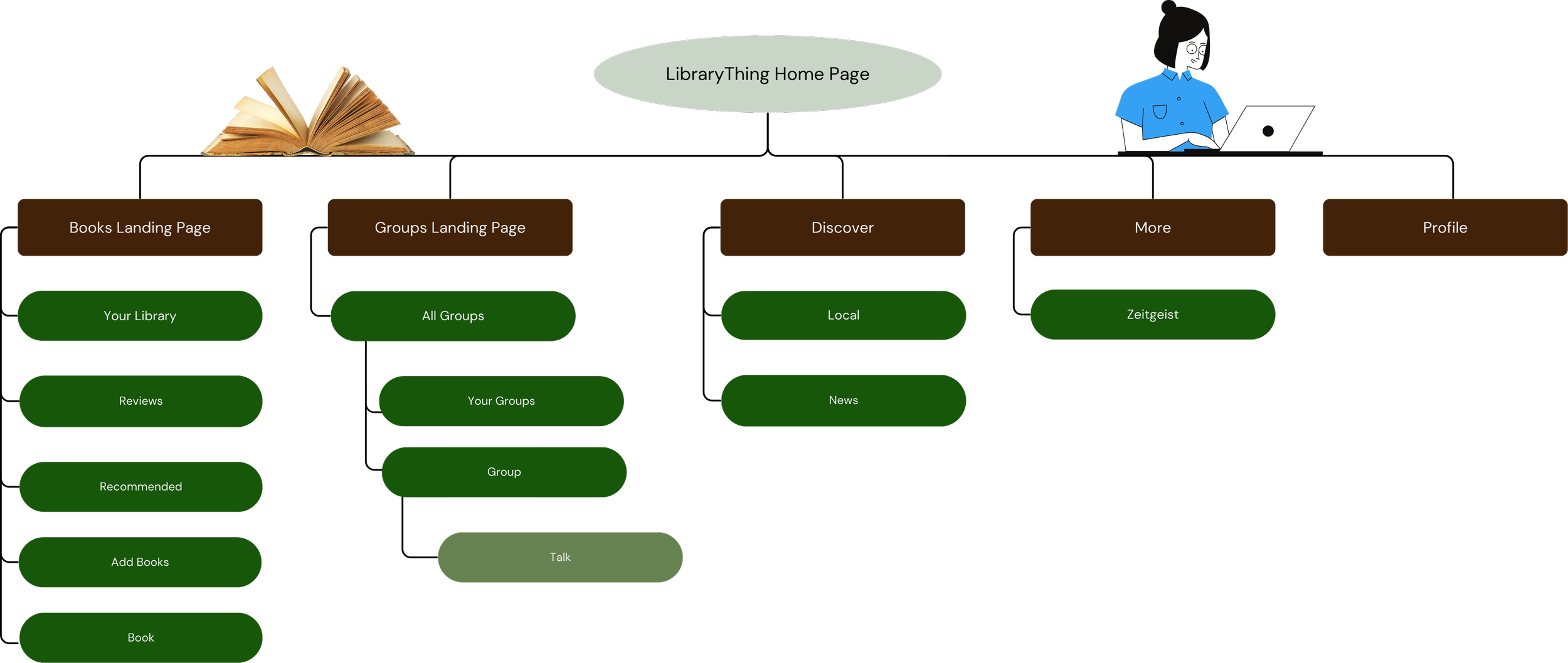
Site Map
One recurring complaint by users was the complicated navigation. There are too many pages on the site—too many clicks required to get to where they need to go. This new site map consolidates information, decreasing users’ cognitive load and increasing consistency across the site.
Wireframe Sketches
-
![]()
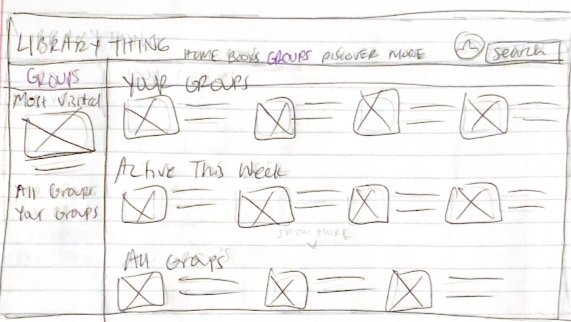
Groups
-
![]()
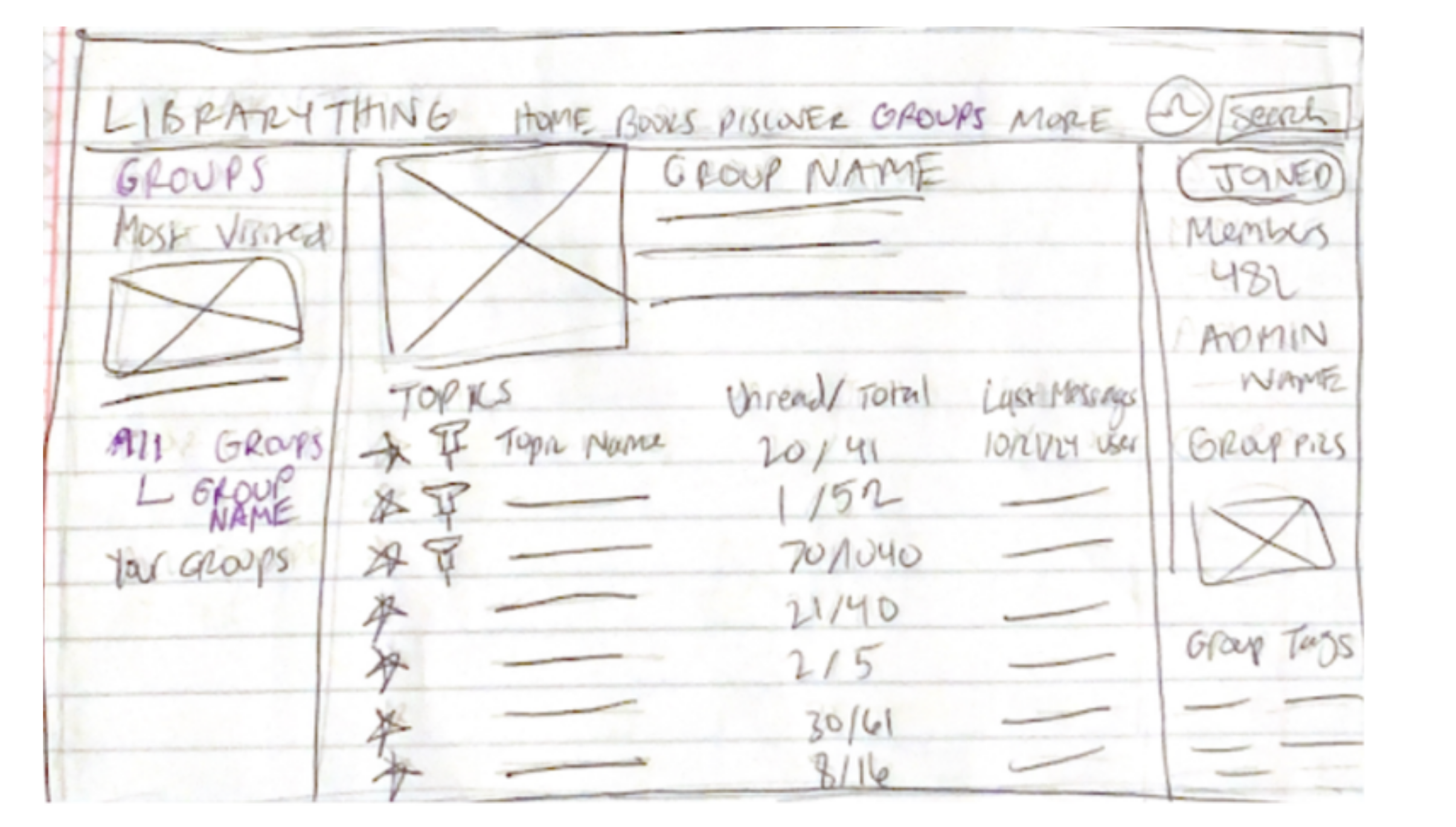
Groups
Group X
-
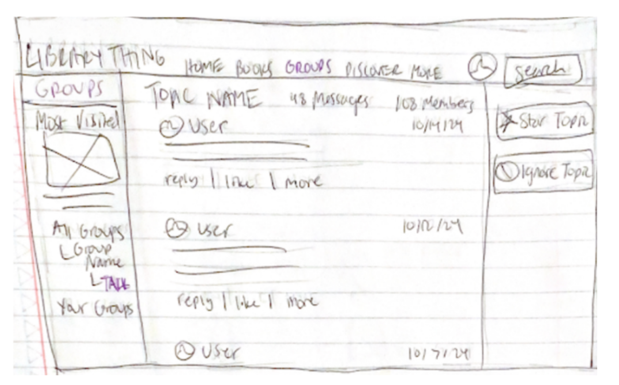
![]()
Groups
Group X Talk
-
![]()
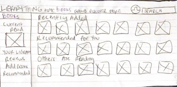
Books
-
![]()
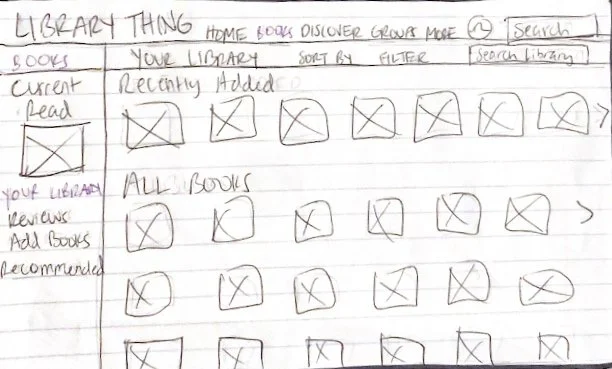
Books
Your Library
-
![]()
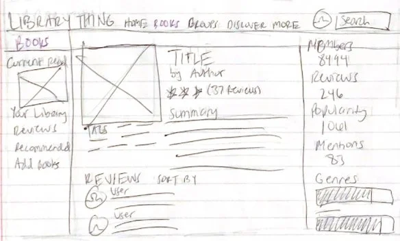
Books
Book X
-
![]()
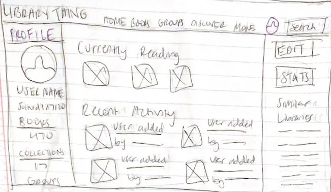
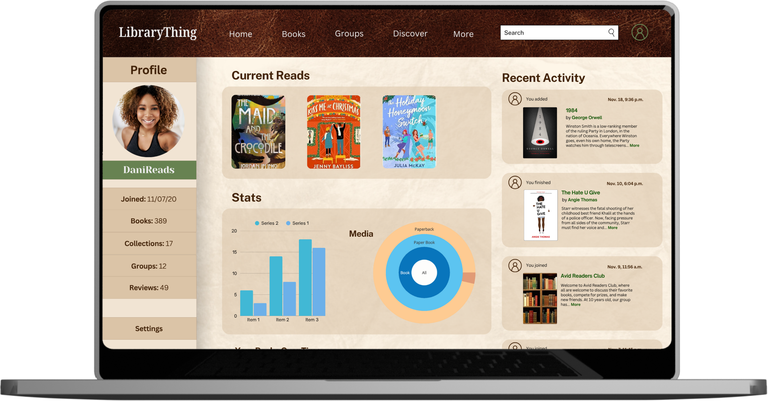
Profile
LibraryThing Redesign
Home
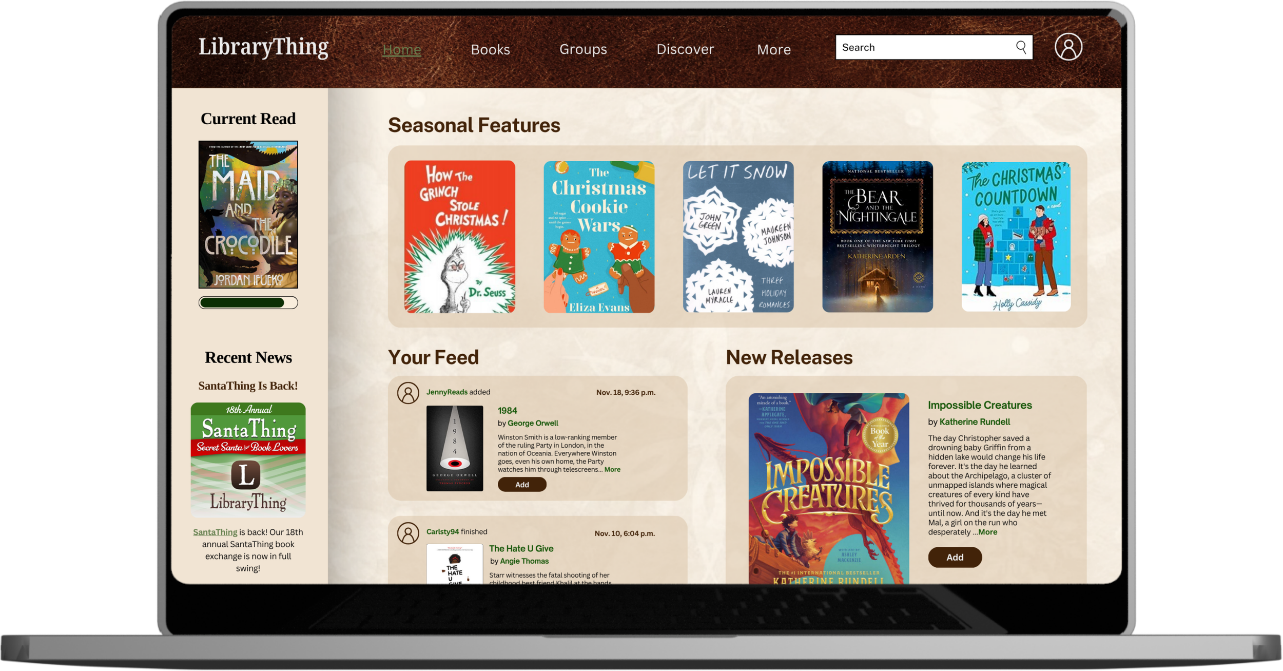
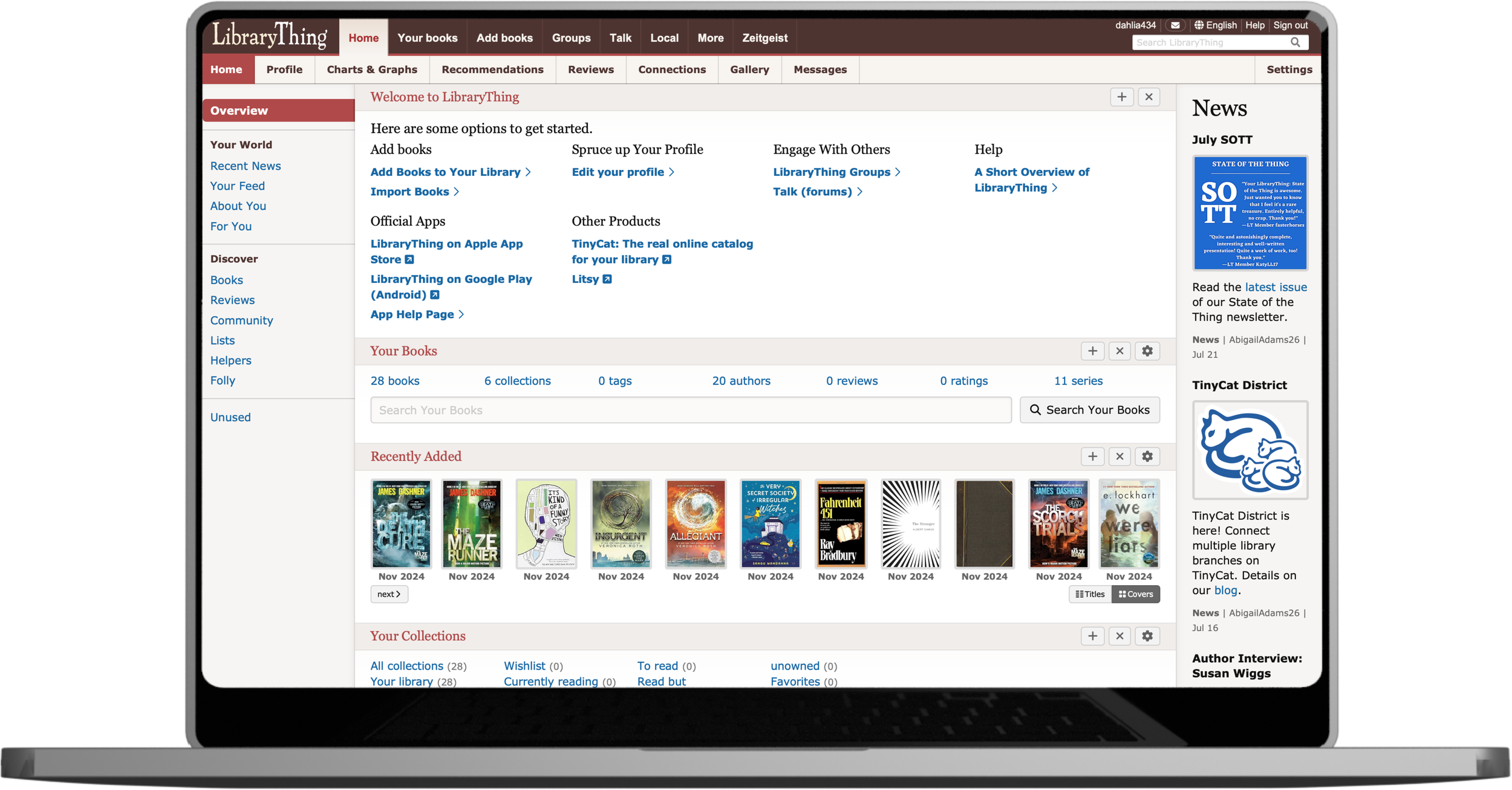

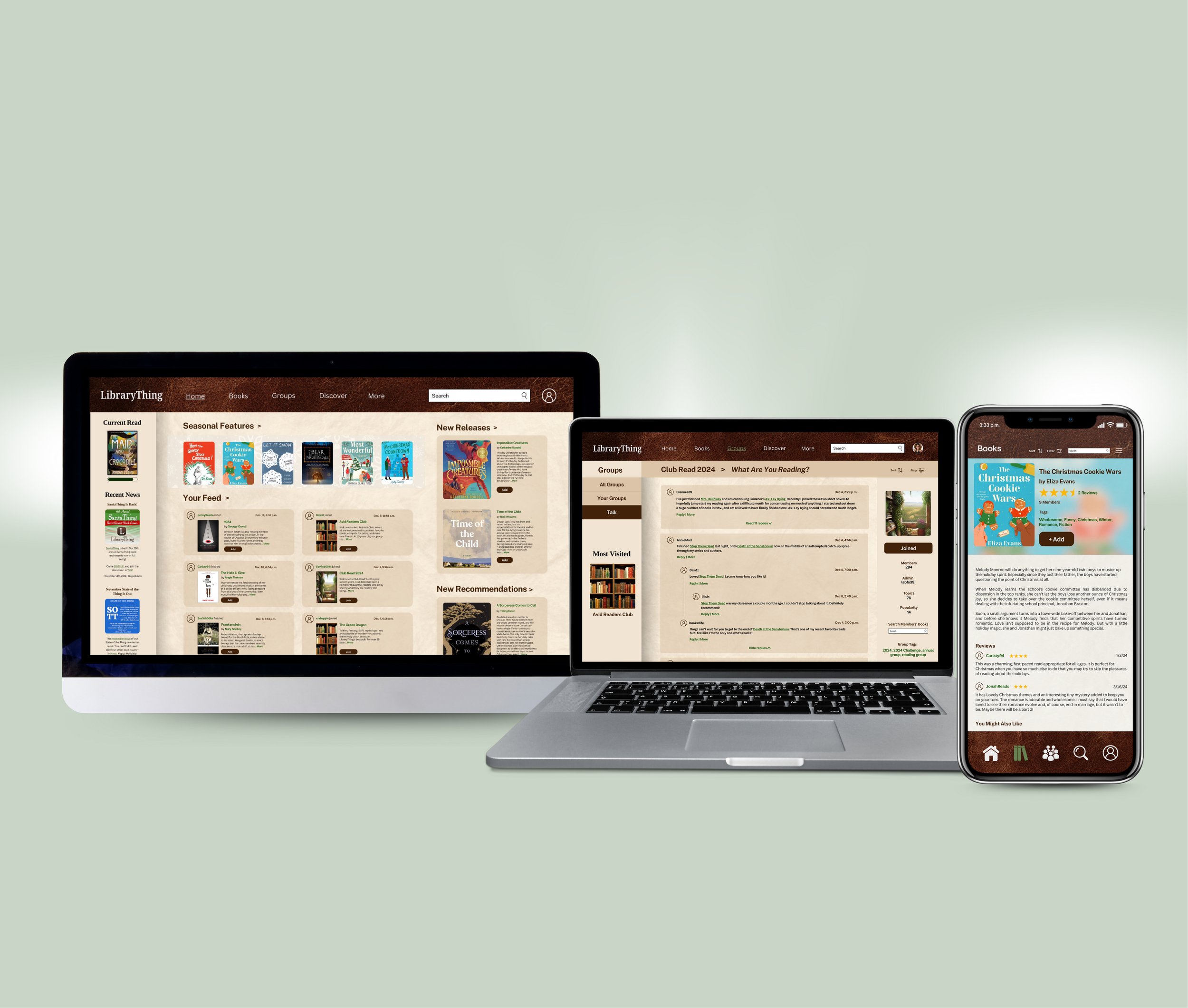
Users complained of a cluttered interface. When someone visits a website, they do not want to be immediately bombarded with 20+ links. It’s overwhelming, confusing, and reduces the trustworthiness of the site. The new LibraryThing interface is organized in a way that gently and clearly guides users while presenting them with different routes.
“When you’re creating a site, your job is to get rid of the question marks.”—Steve Krug, Don’t Make Me Think
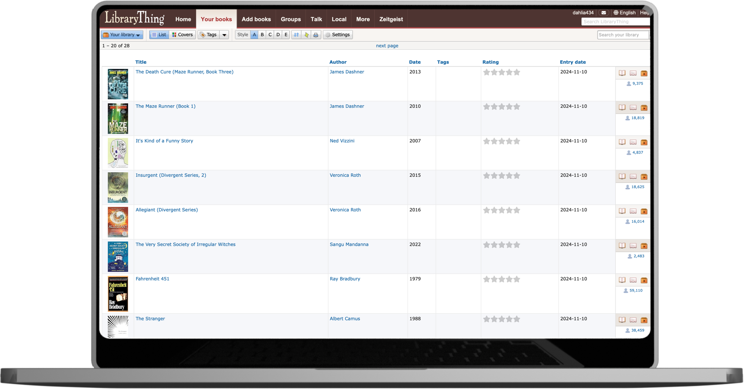
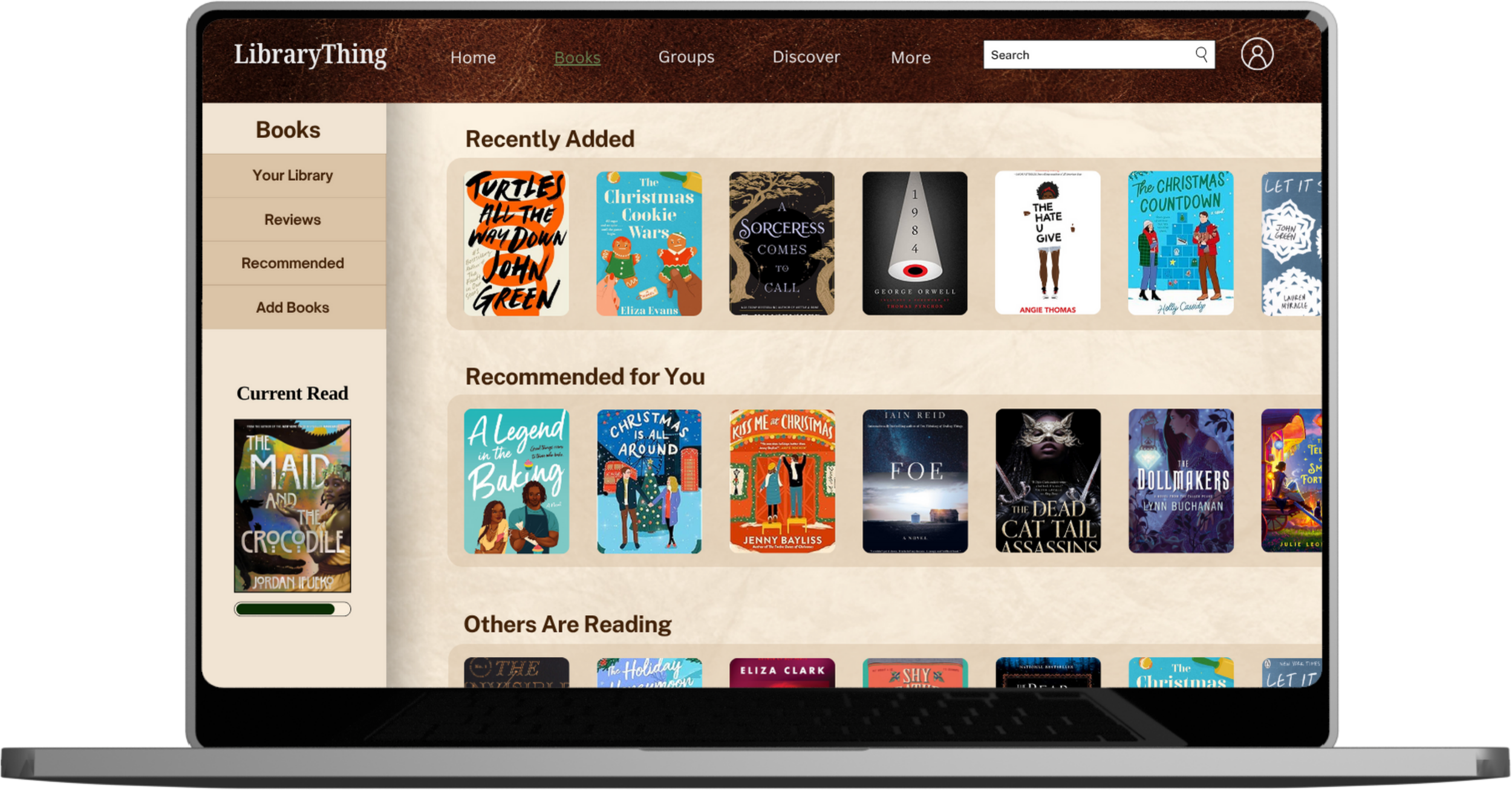
Your Books
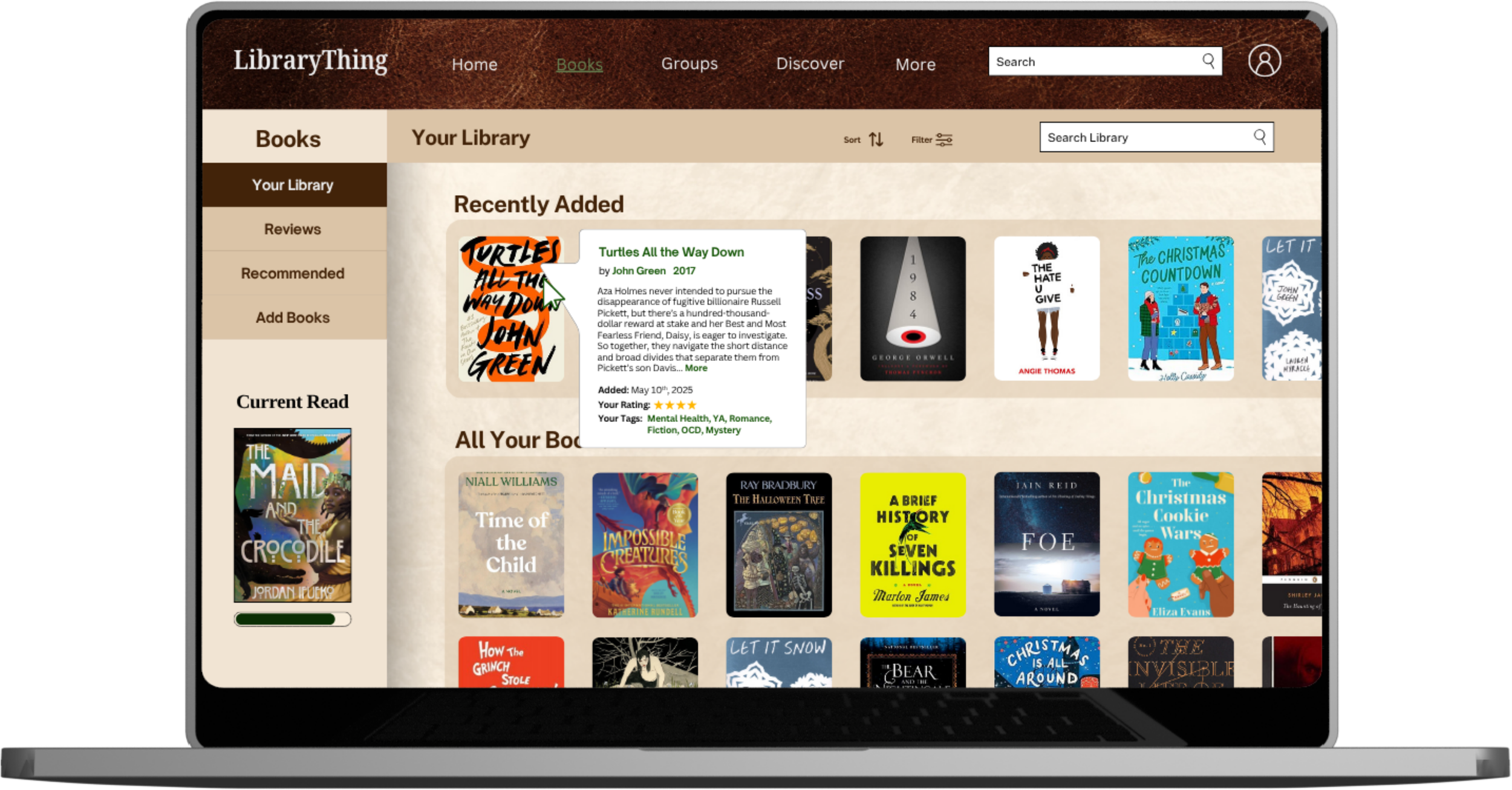
Rather than scrolling through a spreadsheet, users can now view their saved books in a more dynamic way. This menu of book covers allows people to scan, scroll, and hover when they want more information. The new sort and filter features allows users to change what books they see based on authors, tags, ratings and more. These changes address the feedback from users that some things are difficult to find.
Book Overview
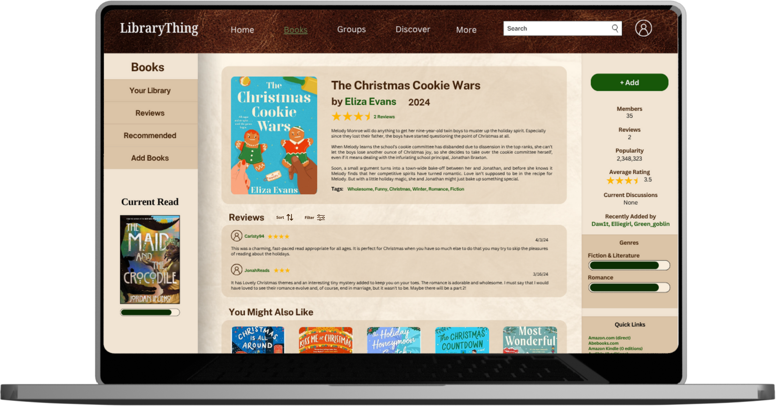
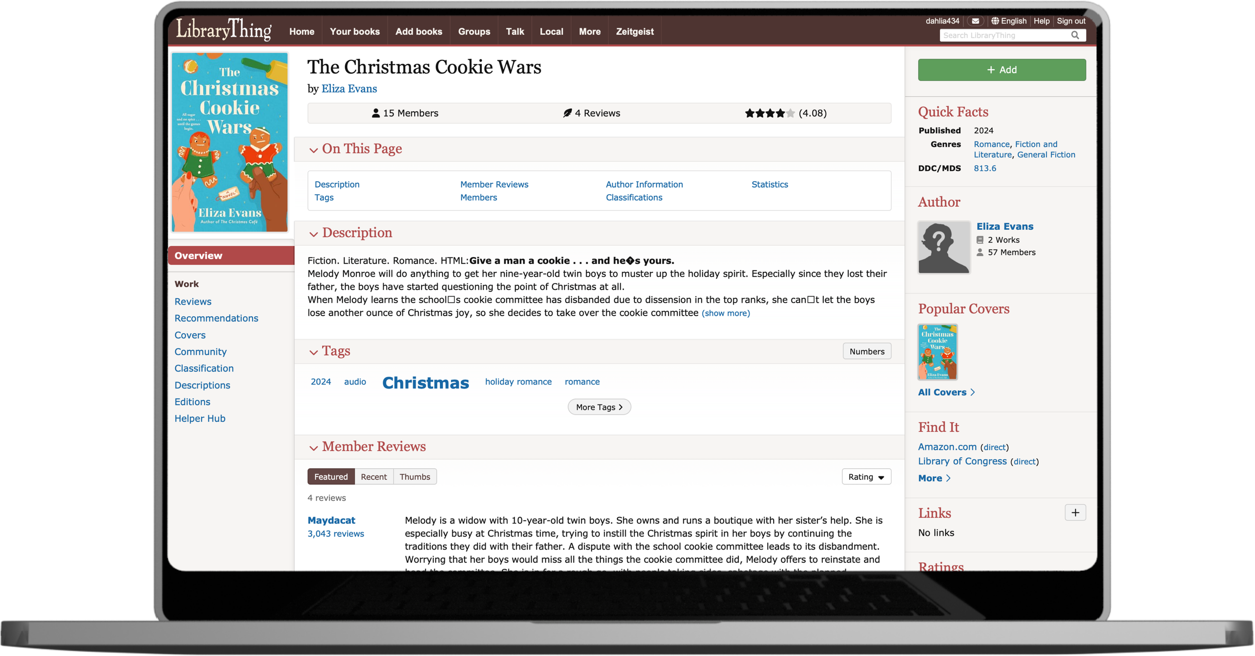
To keep users grounded and aware of where they are in the site, the new Book Overview page is apart of the Books section. Users can sort and filter reviews by rating and key words.
Your Groups: Club Read 2024
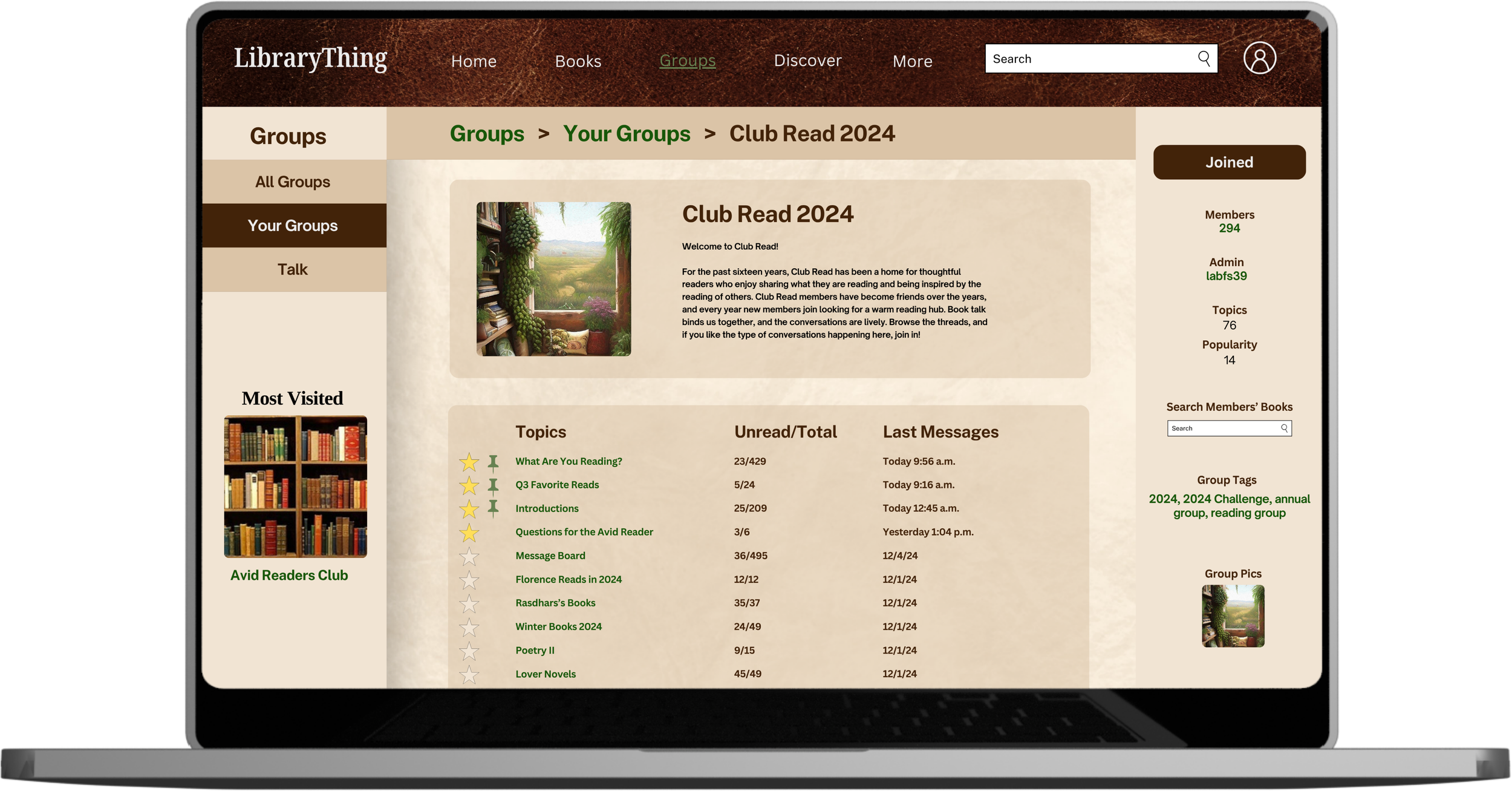
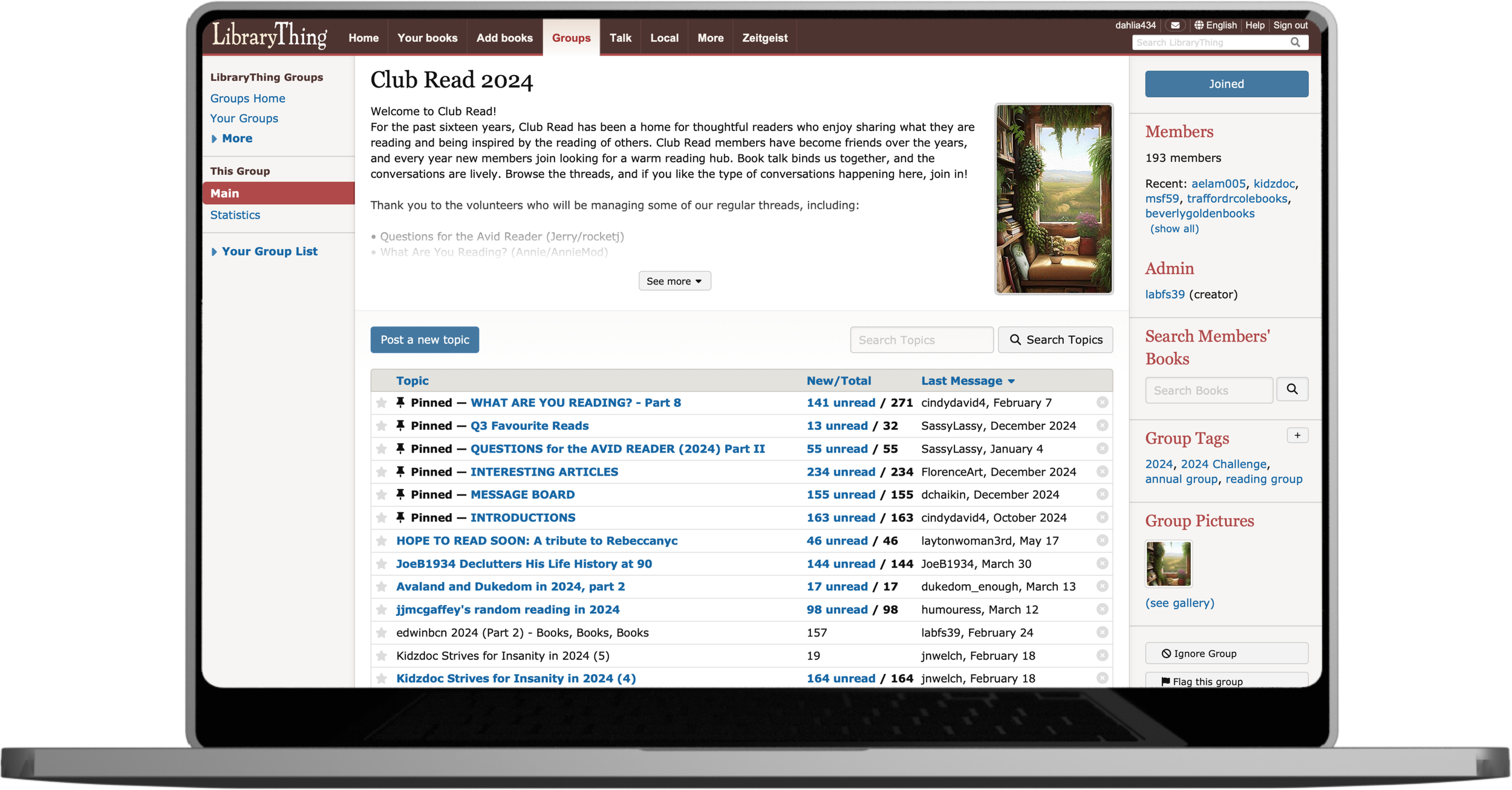
I added a breadcrumb navigation bar at the top of the page so users can easily move through the Groups section of LibraryThing. This clears up the left-hand sidebar. On said sidebar, I added a link to users’ most visited group, so it’s always within reach.
Talk: What Are You Reading?
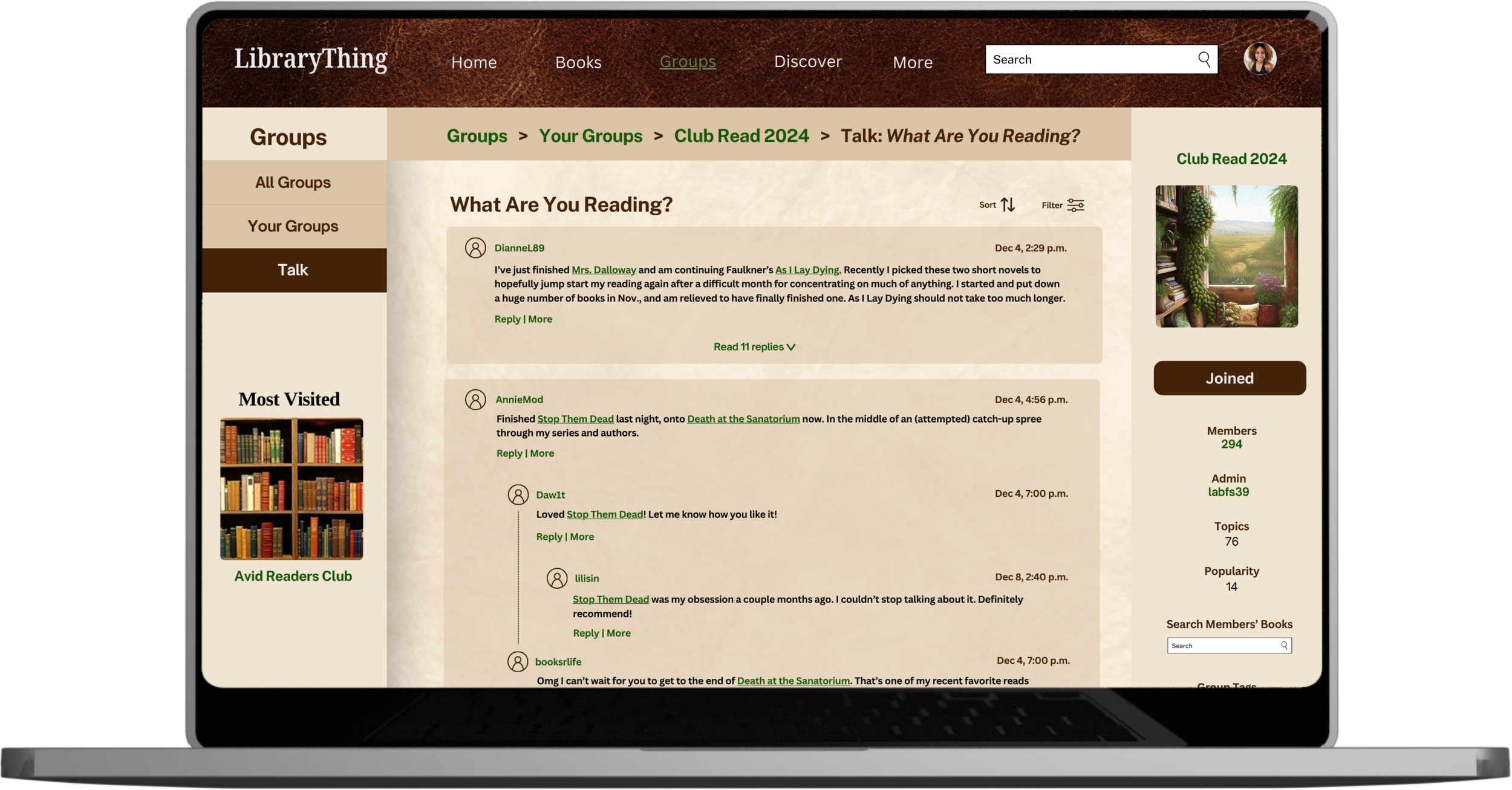
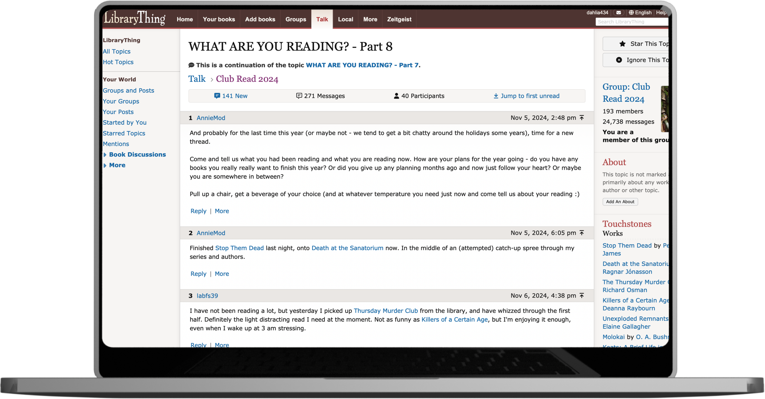
The infamous Talk page is one of the most used yet most challenging parts of LibraryThing. Posts are in reverse chronological order. To read the original post that goes with a reply, users must click a link which scrolls them back up to the original, making it so that they can’t read both side by side. It’s confusing and counterintuitive.
The new Talk page is automatically organized in chronological order with the sort feature available for those who want it a different way. Users can use the dropdown arrow to read replies and hide them, giving them more control over their screen.
“The user should not have to remember information from one part of the interface to another.”— Jakob Nielsen, 10 Usability Heuristics for User Interface Design
More Pages
-
![]()
Books
-
![]()
Profile
-
![]()
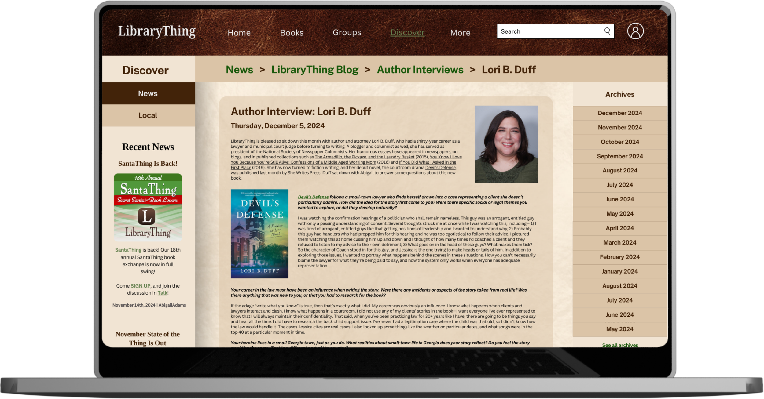
Author Interviews
-
![]()
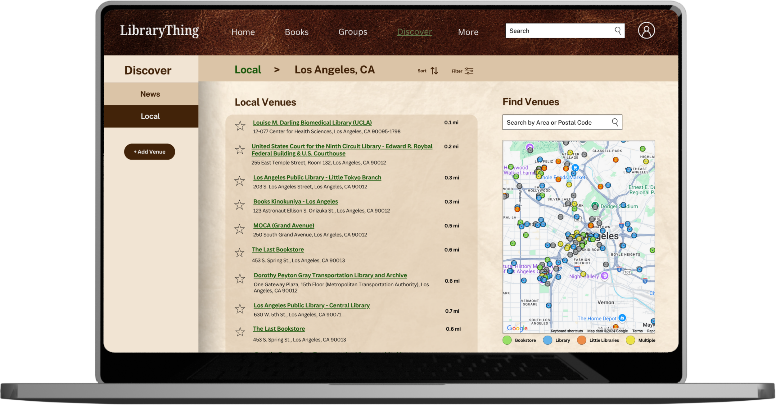
Local Libraries and Bookstores
Key Takeaways
The LibraryThing redesign provided an opportunity for me to overcome my perceived limitations as a student and emerging UI/UX designer. The original website is nearly endless, which required that I stay organized and on schedule. There were times I experienced scope creep, and during those moments, I referred back to my site map and wireframes to keep me from veering off track.