Breathe, Bitch Doula
Reimagining how Families Find and Connect with Birth Doulas
View live site: Breathe, Bitch Doula
Overview
Background: Breathe, Bitch Doula is a digital platform designed to support individuals during pregnancy, birth, and postpartum care by making doula services more accessible, approachable, and emotionally supportive. From childbirth education to postpartum care, BBD facilitates the transition into one of life’s most challenging jobs: parenthood.
Project Goal: to design a calming, trustworthy digital experience that reduces anxiety, clarifies services, and helps users feel supported during a vulnerable and high-stakes life moment.
My Role: UX Designer (research, wireframing, UI, content structure)
Timeline: 6 weeks
Platform: Web (responsive)
Users: Expecting parents seeking emotional and informational support
Constraints: Sensitive subject matter, emotional stress, trust-building
Tools: Figma, Canva, Squarespace
Problem
Expecting parents—especially first-time parents—often experience anxiety, information overload, and uncertainty when seeking birth support. Existing doula websites frequently feel overwhelming, overly clinical, or unclear about services, which can increase stress rather than reduce it.
The challenge was to design an experience that feels calm, inclusive, and relatable while clearly communicating services, values, and next steps.
Users & Design Strategy
Primary users include:
First-time parents unfamiliar with doula services
Expecting parents seeking emotional and informational support
Individuals navigating pregnancy-related uncertainty
Many users are navigating high levels of anxiety, uncertainty, and information overload, making clarity, trust, and emotional safety critical design considerations. They need to know they’re in safe, experienced hands.
Design Strategy
Clear information hierarchy to support quick comprehension
Linear, predictable navigation to reduce cognitive effort
Warm, grounding language to establish trust and relatability
Soft visual hierarchy that guides attention without feeling aggressive
Warm tones and soft edges to emphasize safety and comfort
User Research
Purpose: To assess whether or not new users understand BBD’s service offerings and can navigate the website to contact the company.
Method: Moderated usability observation (remote and in-person)
Participants: 3 tech-savvy adults who have never visited BBD’s website.
Tools used: Google Forms (pre- and post-test questionnaires), Zoom (live observation), and the BBD website
Approach & Constraints: Due to the personal nature of pregnancy, access to the target audience was limited. I focused, instead, on finding participants who were new to the site in order to study accessibility, navigability, and visual hierarchy. To ensure best design decisions about the target audience, I grounded judgments in secondary research, industry best practices, and established healthcare UX principles focused on emotional safety, clarity, and trust-building.
Participants
-
Zach
24 year old future dad from California
-

Griselda
53-year old Nurse Case Manager from California
-

Israel
25-year old Project Supervisor from Illinois
Task Scenarios and Findings
Task 1
Your family is about to welcome another child into the world, and you’re interested in hiring a doula. You want to know more about the services you have to choose from. From the home page, locate the services that Breathe, Bitch Doula has to offer.
Observations
Participants were able to easily navigate to the Services page.
Task 2
You’ve read that many mothers struggle with postpartum depression, so you want to find an option that includes mental health support. Locate the service that includes four sessions with a perinatal therapist.
Observations
All participants took longer than expected. They skimmed for helpful subheadings and expected images to be clickable.
“I should have read instead of skimming for key words.”—Zach
“I’m looking for subheadings that include mental health.”—Griselda
“It’s not a button; it’s just a description.”—Israel
Task 3
You are ready to book the Doula + Flourish package. Find the contact form, and choose the closest option. Don’t fill out the contact form; just choose the service you’re looking for.
Observations
All participants chose different services from the dropdown menu when trying to book the Doula + Flourish package, indicating that there is no clear option for this offering. Later, my client told me she no longer offered this service, which is why there wasn’t an option to book it. It has been removed from the Services page.
“I would have to circle back to the menu.”—Griselda
“There’s nowhere to click and put in the cart.”—Griselda
“I forgot which one it was… There is no closest option.”—Zach
Analysis
My observations revealed that new users are able to find information, but they expect it to boldly announce itself. If they cannot quickly locate key words in the correct location, they look elsewhere. I also found that they expect that the Services page will allow them to book services on the same page on which the services are listed.
This usability observation also revealed ways in which I can improve my research methods. In Task 2, participants focused on finding the arbitrary number “four” rather than the mental health sessions, which was the point of the task. Going forward, I will only include relevant information in task scenario instructions.
Site Map
For organization and clarity, I started with a new site map that reduces clicks and consolidates information. The dotted red lines indicate links to the Contact page through a call-to-action button.

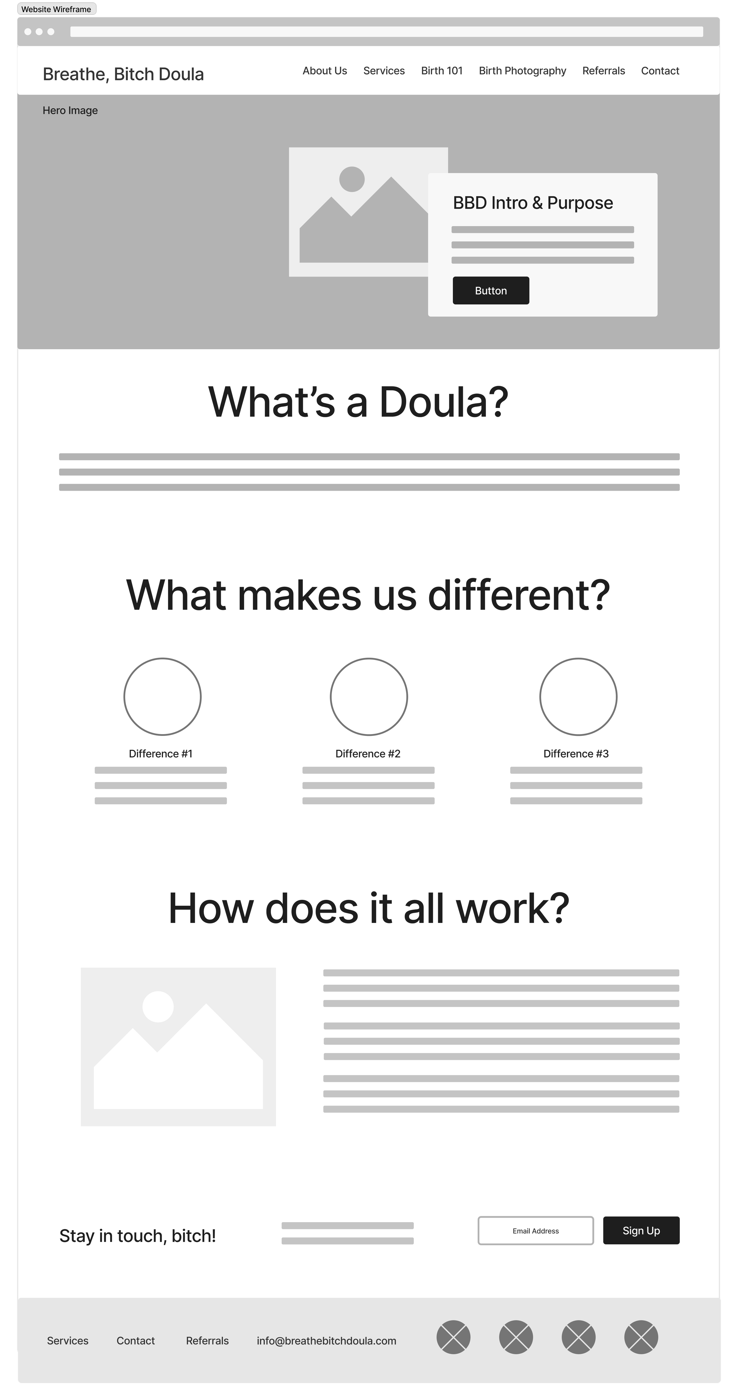
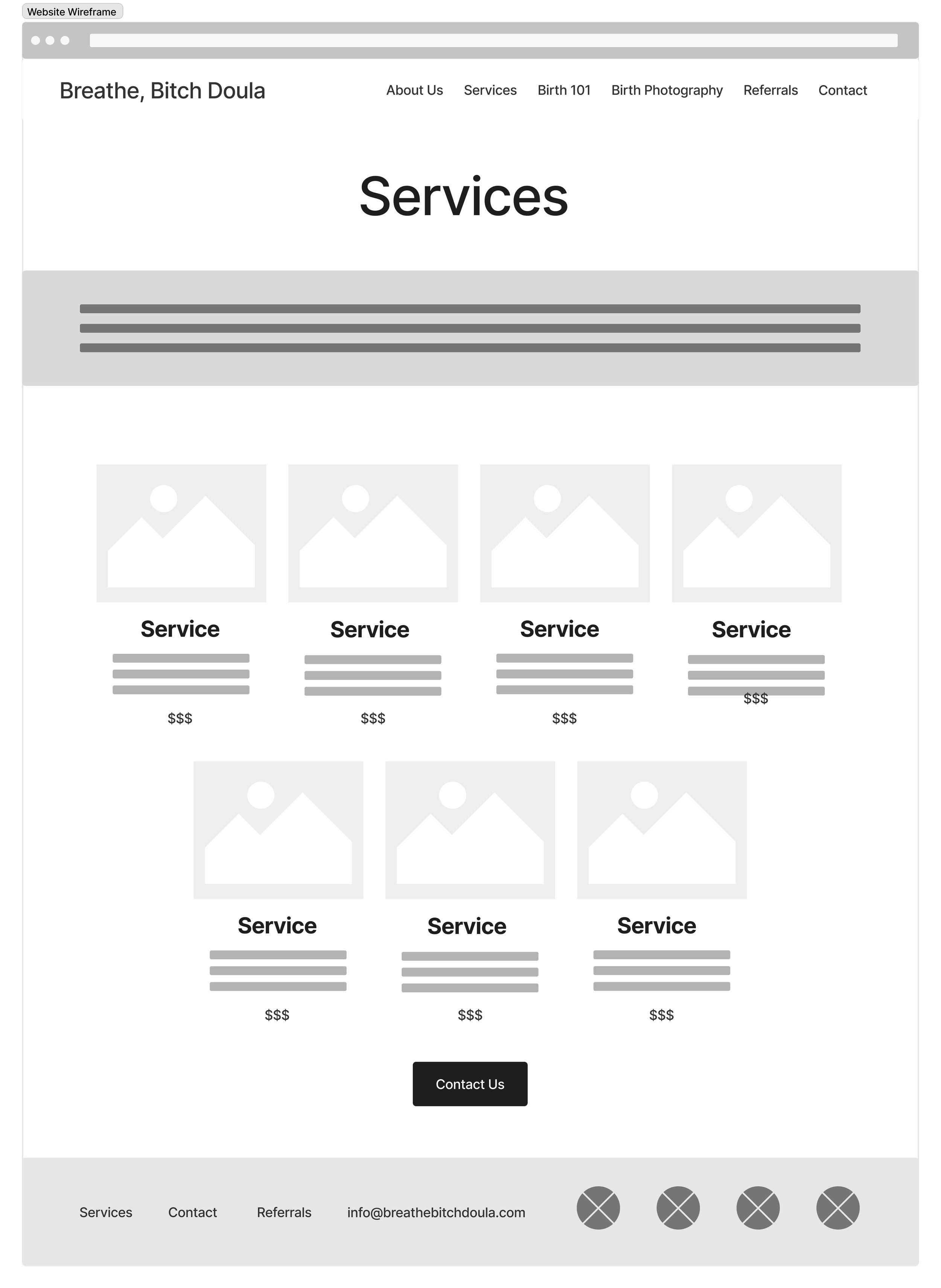
Wireframes
Early wireframes focused on establishing a clear hierarchy and reducing the number of decisions a user must make when navigating sensitive content.


Accessibility
Color Palette: Though my client wanted to keep her brand colors, they were competing with each other rather than complementing each other, making text hard to read and reducing accessibility. I offered an updated color palette, soft and muted, to reduce visual stress and strain. The color palette now meets WCAG standards.
Alternatives: I added more images paired with descriptive alternative text for users who use screen readers.
Typography: I used a simple, professional with readable type sizes and generous spacing.
Content: Content is written in plain, inclusive language, and complex processes are explained at a high level to avoid overwhelming users new to the birth process.
Old
New
Results

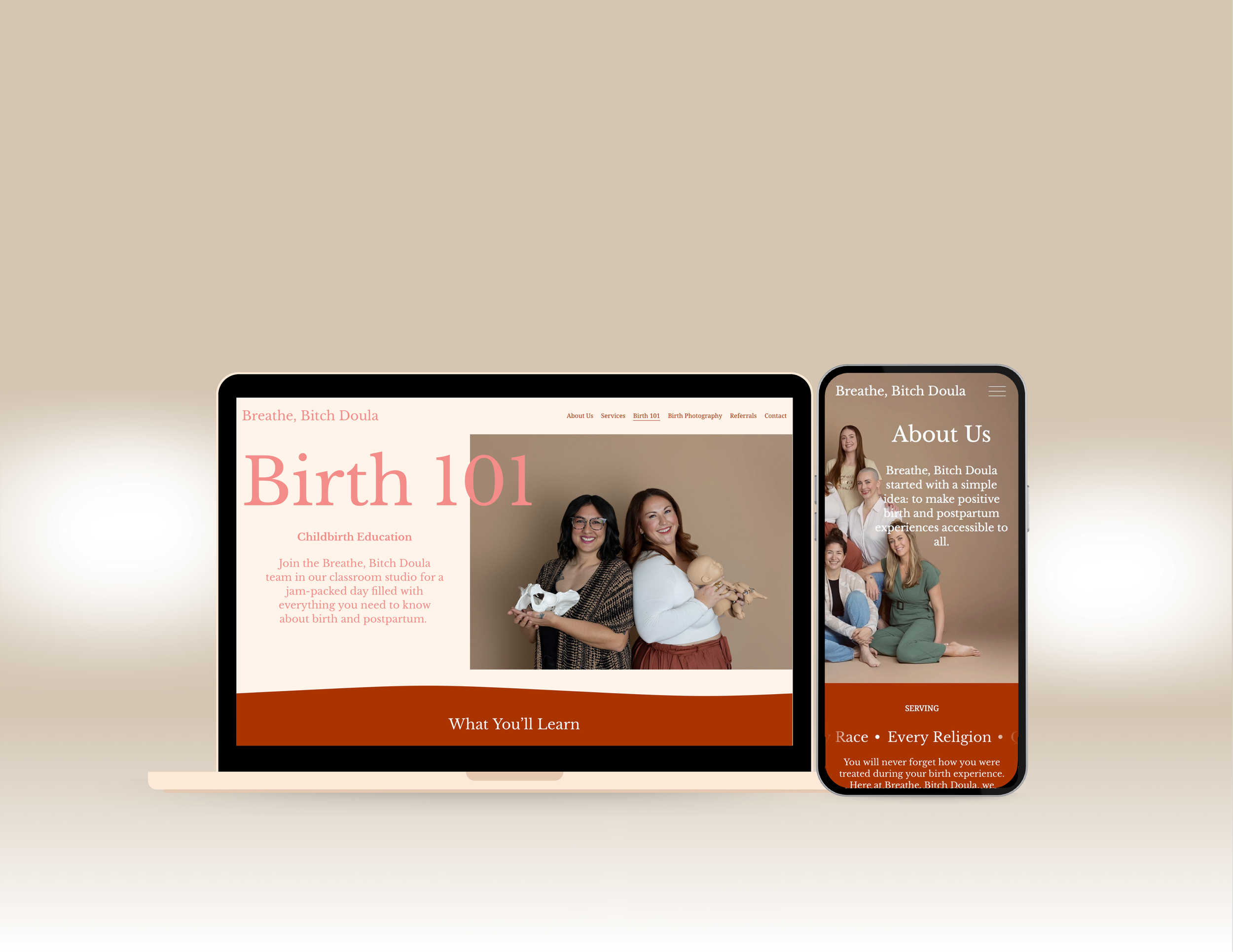
Home


The home page now has more depth and clear descriptors. “I’m listening…” is now “Services,” removing all obscurity from the first button of the website. I included FAQs, Testimonials, and What’s a Doula? in more relevant pages to reduce information overload.


“On the average Web page, users have time to read at most 28% of the words during an average visit; 20% is more likely.” —Jakob Nielsen
Users scan. Short, numbered bites of information reduce noise, allowing them to quickly find what they are looking for.
About Us

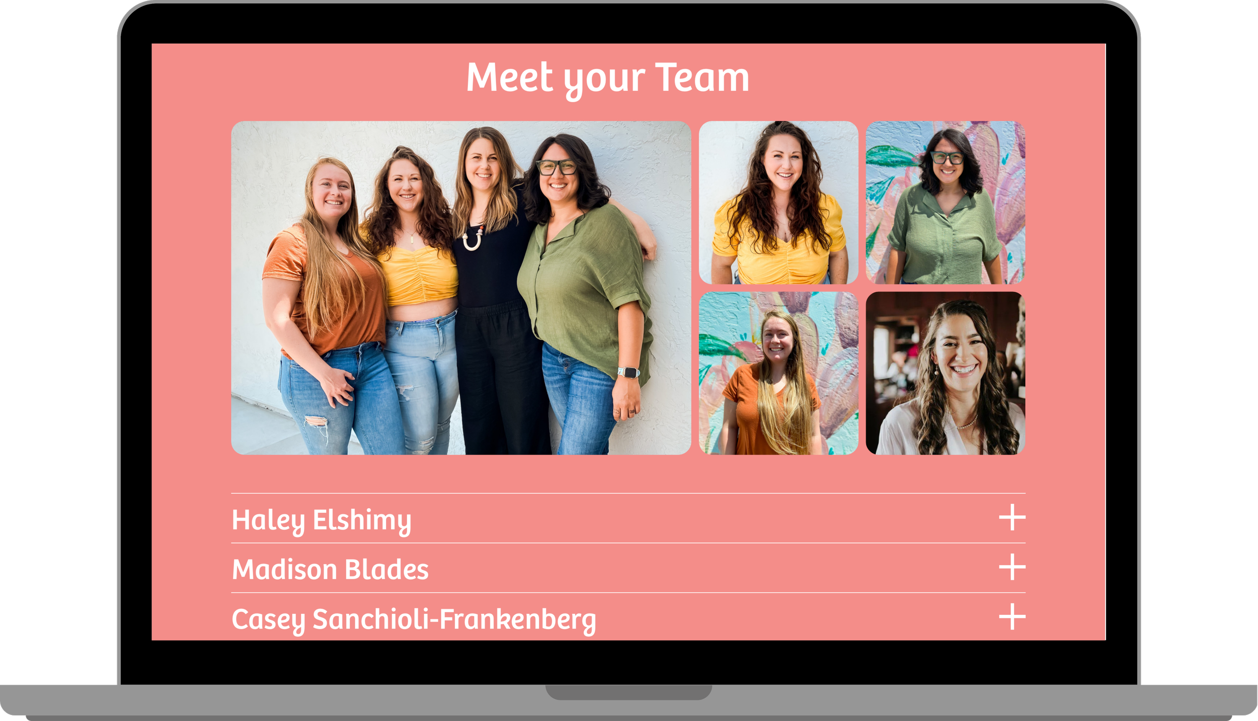
To increase clarity about what name goes with what picture, I turned the drop-down menu of names and bios into a simple scrolling menu.
Reflections
Wins
Designing for relatability and emotional safety:
What worked: The use of soft visual hierarchy, generous spacing, and everyday language helped create a calm, non-intimidating experience.
Impact: Primary research participants consistently navigated the interface without confusion, suggesting strong clarity and structural usability despite the emotional subject matter.
Clear, Low-Friction User Flow:
What worked: A linear, predictable navigation path reduced decision fatigue and guided users toward next steps without pressure.
Impact: This reinforced the importance of simple, supportive workflows in healthcare-adjacent UX.
Strong Foundation for Future Research
What worked: By designing conservatively and documenting assumptions, the experience is well-positioned for future validation and iteration with the target audience.
Impact: The project established a scalable foundation that could evolve with user feedback while minimizing risk to vulnerable users.
Challenges
Limited Access to Target Audience:
Why it mattered: Designing for expecting and postpartum parents requires sensitivity, accuracy, and emotional awareness. Without direct access to this group, there was a risk of making assumptions that could negatively impact trust or usability.
What I did: I mitigated this by grounding design decisions in secondary research, healthcare UX best practices, and primary usability testing with participants outside the target audience. Research focused on accessibility, visual hierarchy, and navigability to ensure the experience was structurally sound and low-risk.
Insight: This reinforced the importance of clarity-first design decisions when working in healthcare-adjacent contexts without full research access.
Third-Party Contact Form
Why it mattered: Research participants expected to be able to contact the company/book services directly on the Services page, but the contact form was not available for me to edit.
What I did: I made it so that the Services page opens up on a new tab, allowing users to view descriptions alongside the form rather than clicking the back button when they have to reread services. I communicated the user feedback to the owner of the form, so they could make an informed decision about how to optimize contact between the company and potential clients.